
Transform your space with the perfect living room paint colors—because the right shades can do more than just look good; they set the tone for how you feel, live, and connect in your home.
Color and psychology are closely connected, influencing everything from your mood to the energy of your home.
Think about this: have you ever felt at ease in a room with soft greens or inspired in a space with bold blues? That’s color psychology at work.
Green, for instance, often creates balance and calm, while red can bring energy and passion.
Blue tones are known for their soothing effects and can help your living room feel peaceful.
When deciding on good paint for walls, it’s essential to think about how colors affect mood and the overall feel of your space.
Find out how to choose the perfect color palette for your living room. Will make a big difference to how the space feels at the end.
In this post, you’ll learn about the psychology behind color and how to create a living room that reflects your style while setting the right tone for your home.
Understanding Color and Psychology
“The psychology of color is a cornerstone of great interior design, as it can subtly yet powerfully shape how we interact with a space.”
- Karen Haller, behavioral color consultant, in her book The Little Book of Color (2019).
Color plays a significant role in shaping how you feel and behave in a space. It’s not just about aesthetics.
Color and psychology are deeply connected.
The colors you choose for your living room can influence your mood, energy, and even how others feel when they visit.
Here are some basics behind the most popular color palettes.
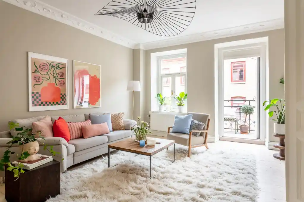
Warm colors (like red, yellow, and orange):
- Bring energy and warmth to a space.
- Make a room feel lively and inviting.
- Are perfect for social areas but can feel overwhelming in large doses.

Cool colors (like blue, green, and purple):
- Create a calm, soothing environment.
- Help rooms feel spacious and peaceful.
- Ideal for relaxation or unwinding after a long day.

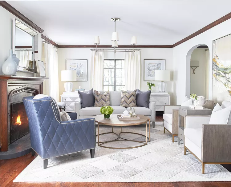
Neutral tones (like white, gray, and beige):
- Offer balance and versatility.
- Act as a backdrop for colorful accents.
The psychology behind color reveals how these choices impact your space. For instance:
- Red stimulates activity and passion.
- Blue encourages calm and focus.
- Green promotes harmony and balance.
Understanding these basics will help you create a living room that feels just right. Your paint color isn’t just decoration, it’s part of the mood and aesthetic.
The Psychology of Color When Choosing Living Rooms Paint Colors
“The use of expressive color in design affects the atmosphere and emotional impact of a space.”
- Leatrice Eiseman, Executive Director of the Pantone Color Institute, speaking at a color trends seminar (2019).
Each color you choose for your living room does more than add visual appeal. It influences the mood, energy, and overall atmosphere of the space. Understanding the psychology behind color helps you select shades. These shades should align with how you want your living room to feel. Whether you’re aiming for calm, vibrancy, or timeless elegance, the right paint and accents can transform your room into a space that is perfect for you.
Here’s a closer look at the psychology of specific colors, including ideas on how to incorporate them:
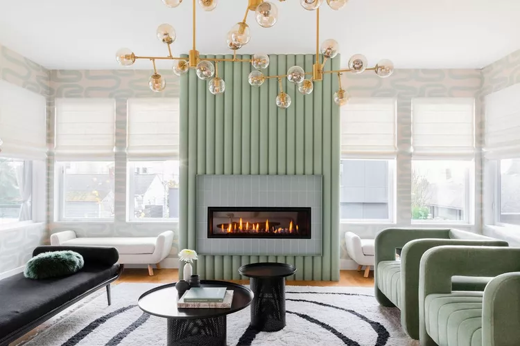
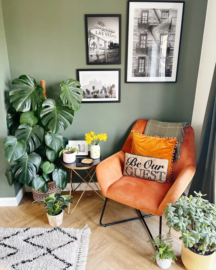
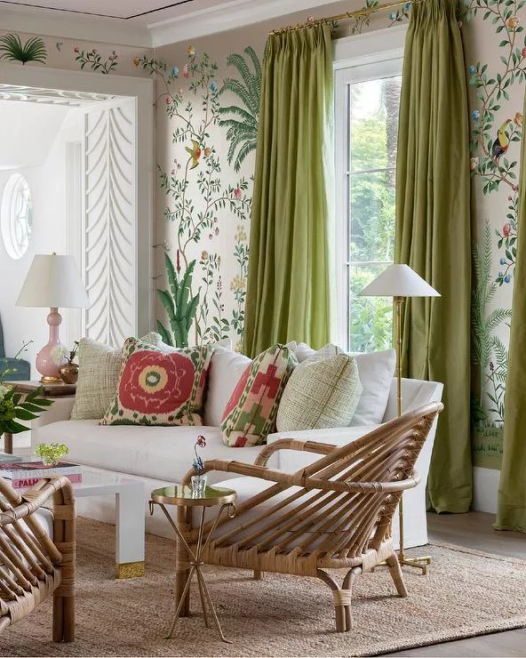
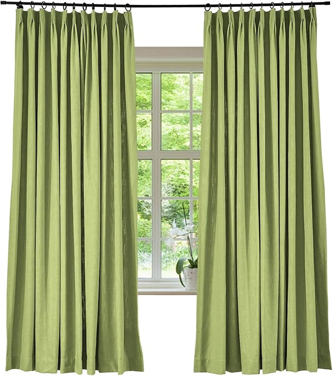
Green: A Calming and Rejuvenating Choice
Color psychology around green ties the color to nature and tranquility. Making it an excellent choice for creating a fresh and balanced feel. Green promotes relaxation and renewal, making it perfect for spaces where you want to unwind or recharge.
Ideas for using green:
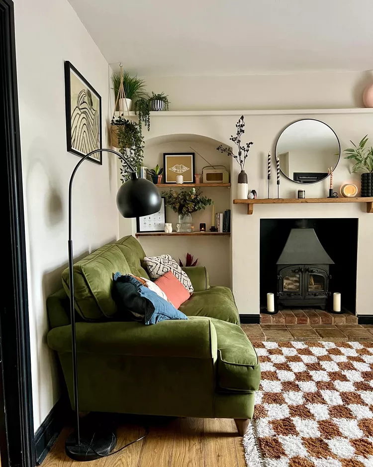
Pair deep emerald green furniture with light beige walls for a modern yet natural look.
Paint one accent wall in a soft sage green for a subtle, calming vibe
Use potted plants or botanical prints to bring in green accents without committing to paint.
Blue: A Serene Choice for Peaceful Energy
Blue is well known for its calming effects.
When working with color psychology blue is used to create a quiet and welcoming space. Making it a great color for a living room.
It also has the bonus of helping to make small spaces feel more open.
Ideas for using blue:
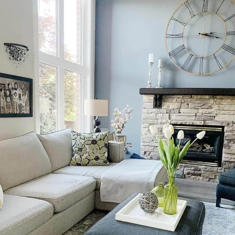
Choose a pale blue for your walls to reflect light and make the room feel airy.
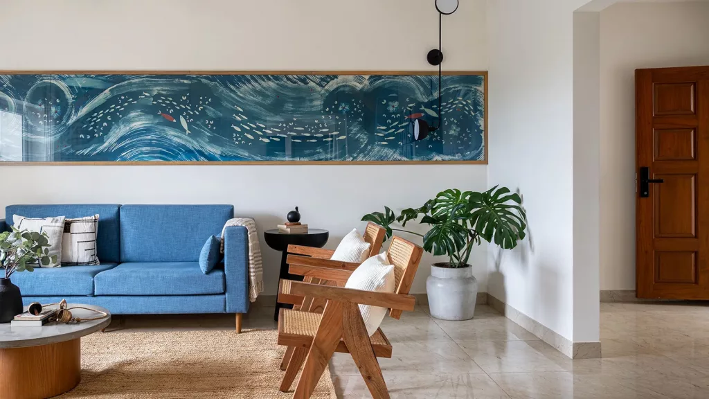
Combine blue with natural materials like wood or hemp to balance the cool tone with warmth

Incorporate navy blue throw pillows or a rug against neutral furniture for a bold, elegant touch.
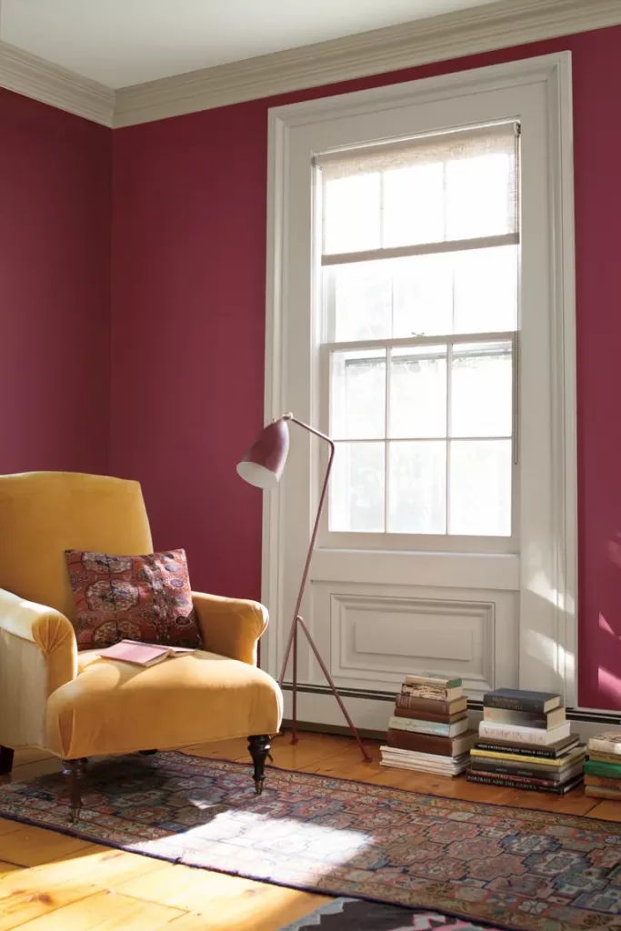
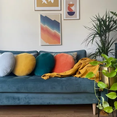
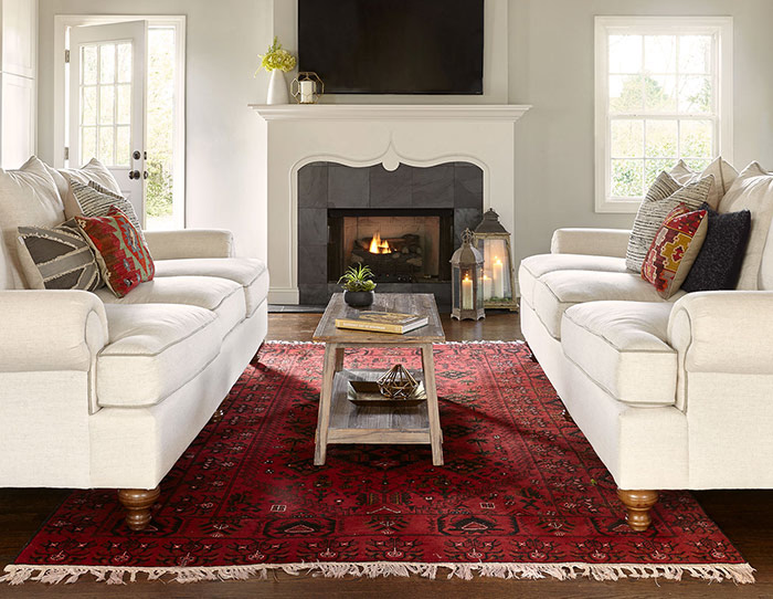
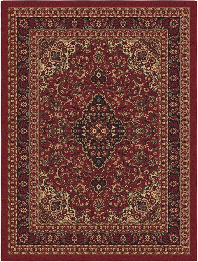
Red: Adds Energy and Vibrancy
The color psychology of red is all about energy, passion, and warmth.
However, it has the potential to feel overwhelming.
Along with color theory, there is a belief that adding a pop of red in any space helps bring the room together.
In living rooms, red works best in moderation as an accent.
Ideas for using red:
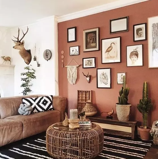
Use a muted terracotta red for an earthy, grounded feel.
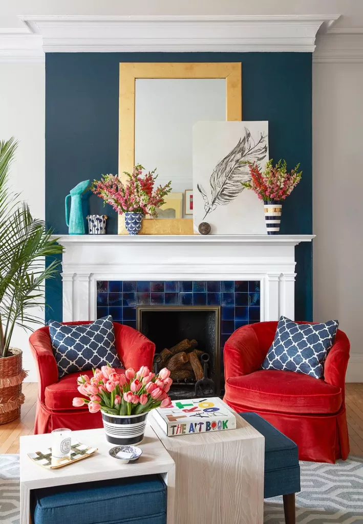
Add a pop of red with a statement chair or artwork to create a focal point.
Pair red accents with neutral tones to balance its intensity.
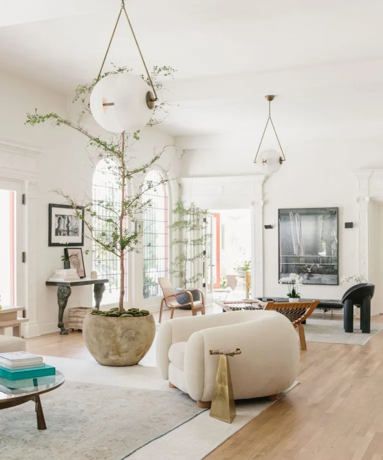
Neutral Tones: Versatile and Timeless
Gray, beige, and white are classic choices for living rooms because they offer a clean, versatile backdrop.
While neutral tones are safe and versatile, they can feel bland without some thoughtful accents.
This is where the pops of the other colors come in.
Ideas for using neutral tones:
Paint soft gray or creamy white walls to create a light, airy space.
Use natural materials – wood, wicker, or stone to bring depth and warmth to neutral spaces.
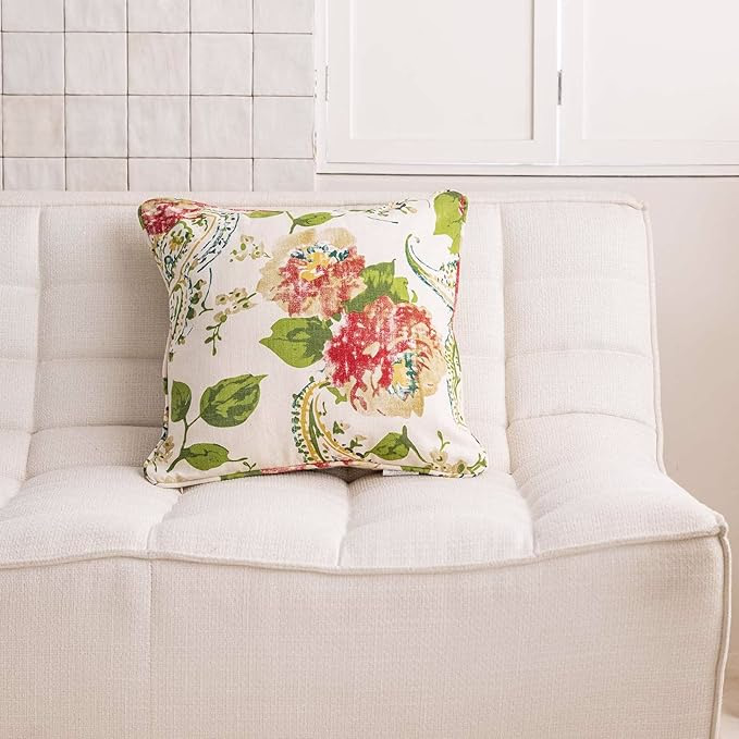
Add texture with throw blankets, rugs, or curtains in complementary colors like navy or mustard.
Balancing Your Palette
When deciding on a good paint for walls, think about the mood you want to set.
You can easily have a perfectly balanced living room by using the psychology behind color. Mix and match tones to create the vibe you are looking for:
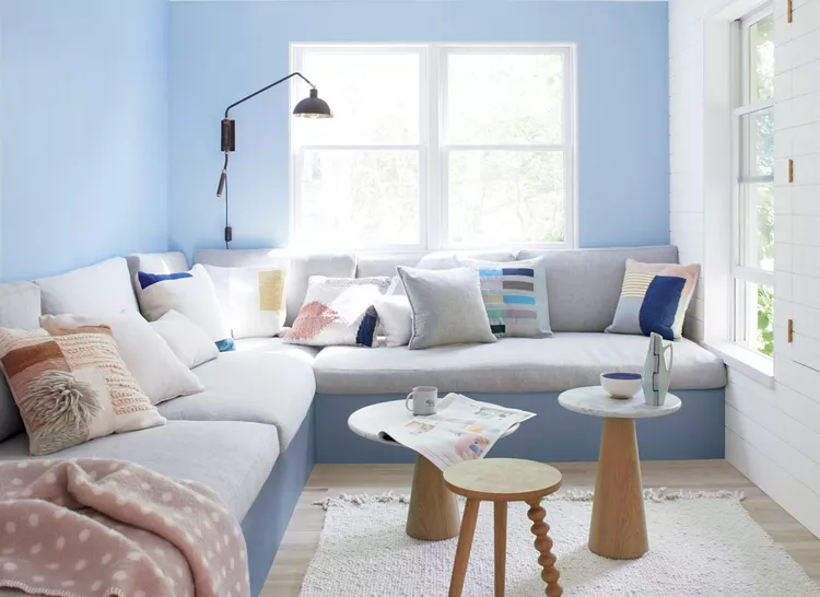
Use blue and gray together for a peaceful, coastal-inspired room.

Combine green and neutral tones for a fresh, organic look.
Pair red accents with beige walls for a cozy, vibrant space.
Understanding how these colors work allows you to design a beautiful living room.
Living Room Paint Colors for Different Moods
“In the home, color is a language. It communicates personality, mood, and comfort.”
- Terence Conran, from The Essential House Book (1994).
Your living room’s aesthetic and vibe depends on the colors you use.
Whether you want relaxing, energetic, or cozy vibes. The right living room paint colors can help you create the atmosphere you want.
Here’s how to choose the right palette and how to incorporate it into your space.
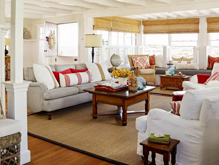
Relaxation: Soft Blues, Greens, and Muted Tones
To craft a calming and serene living room opt for soft blues and greens These hues give feelings of peace.
This palette is a great way to balance a space and bring styles together. Making them some of the best li
They also offer balance. This makes them some of the best living room colors for relaxation and energy balance.
Muted tones like light gray or beige also give off a soft and relaxed vibe.
Ways to incorporate these colors:
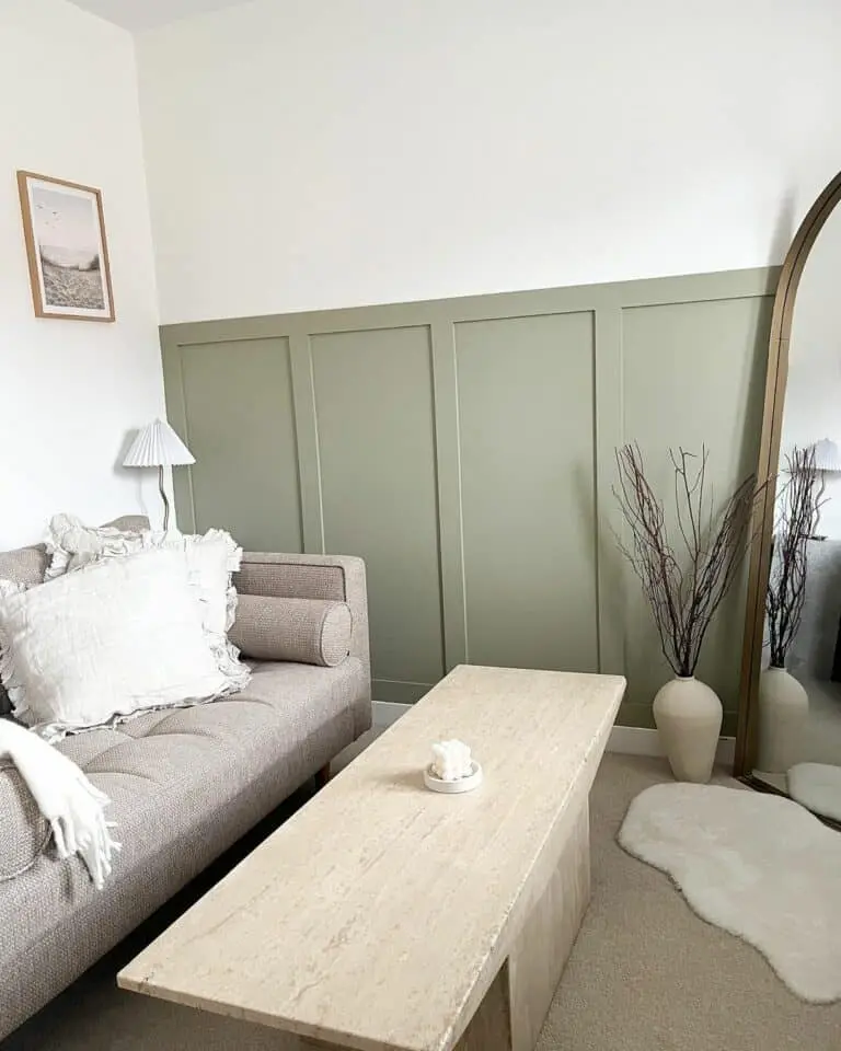
Use board and batten detailing on a feature wall with a muted green to add texture.
Include accent pillows or curtains in complementary shades for a cohesive, calming design.
Paint all the walls in a pale blue or green for a spa-like effect.

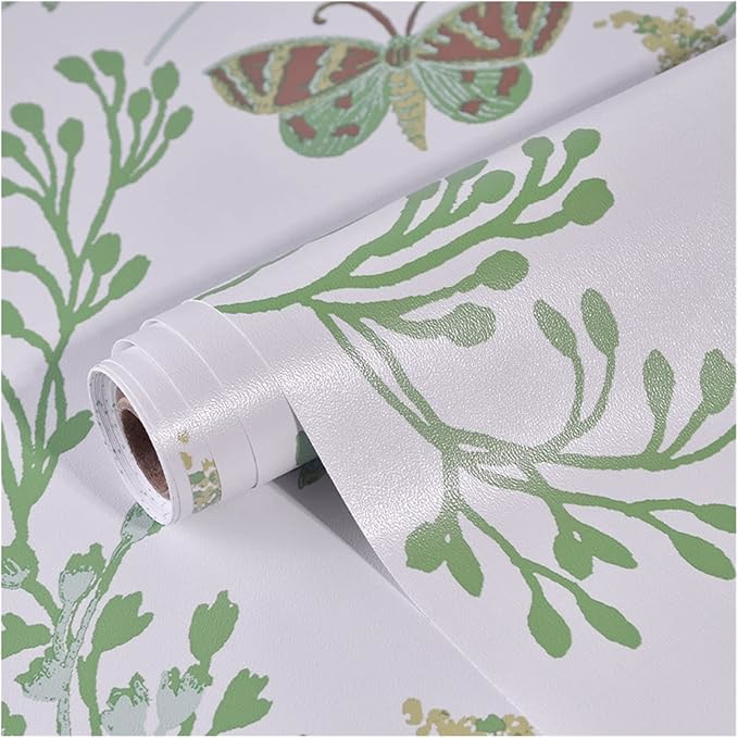
Add soft gray or beige through wallpaper with subtle patterns for an elegant look.

Bright Yellows, Oranges, or Red Accents: Energetic Living Room Paint Colors
If you want to energize your space, consider brighter tones like yellow, orange, or red. These colors make your living room feel lively, happy, and vibrant. Using them strategically ensures they don’t overwhelm the space.
Ways to incorporate these colors:
Create an accent wall in a bold yellow or orange for a pop of energy.

Paint wainscoting in a warm shade while keeping the upper walls neutral.
Add red with furniture, like an armchair or a vibrant rug.

Use removable wallpaper with geometric patterns featuring these tones to create interest without commitment.

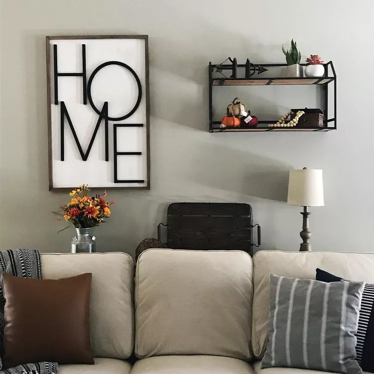
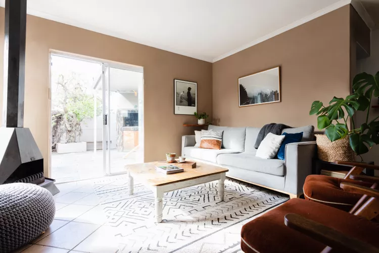
Cozy Living Room Paint Colors Like Warm Neutrals Like Taupe and Deep Browns
To make your living room feel welcoming and cozy, warm neutrals are the way to go. Colors like taupe, caramel, and deep brown add depth and comfort, creating an inviting space.
These tones work perfectly for both entertaining and relaxing spaces.
Ways to incorporate these colors:
Paint the walls in taupe for a timeless, cozy backdrop.
Incorporate warm neutrals through throw blankets, area rugs, or lampshades.
Add subtle patterns with wallpaper in beige or taupe hues for visual interest.

Use deep brown wood paneling or shiplap to add warmth and texture.
Mood Lighting and Accessories
Once you’ve selected your paint colors, don’t forget to balance the mood with appropriate lighting and accessories.
Use dimmable lights to adjust brightness for relaxation or socializing.
Add metallic or natural accents to complement your color choices.
By understanding how living room paint colors set the tone for the room. You can create a space that reflects your style while promoting the vibe you want. Whether it’s tranquil, lively, or cozy.
Common Mistakes to Avoid When Picking Living Room Paint Colors
“When designing interiors, the psychological effects of color must align with the function of the space to truly enhance its purpose.”
- Judith Heerwagen, environmental psychologist, in a presentation on workplace design (2006).
Choosing the perfect living room paint colors can feel overwhelming, but avoiding a few common mistakes makes a big difference.
The good news? Most of these issues are easy and affordable to fix. Here’s what to watch for and how to solve it without breaking the bank.
Choosing Colors Based Only on Trends
Trendy colors can be appealing, but they don’t always suit your space or personal style.
For example, bold colors like deep teal are everywhere right now. However, it may clash with your furniture or overwhelm a smaller room.
How to fix it:
- Test paint samples on your walls before committing. Many stores offer sample sizes for under $5.
- Pair trendy hues with neutral tones. Use the bold color as an accent on one wall or through accessories like pillows and rugs.
- Focus on colors you’ll enjoy long-term rather than chasing trends.
Ignoring the Impact of Natural and Artificial Light
Lighting changes how colors look throughout the day.
A shade that looks perfect in a well-lit store might feel dull or harsh in your living room.
How to fix it:
- Test paint swatches on all walls and note how they look at different times of day.
- If your room lacks natural light, choose lighter, reflective shades like pale yellow or cream to brighten the space.
- Use soft, warm lighting to enhance your color choices. Affordable LED bulbs with adjustable warmth are a great choice.
Overloading a Small Space with Dark Colors
Dark shades can make a small living room feel cramped and unwelcoming. While moody tones can add drama, they need to be balanced carefully in compact spaces.
How to fix it:
- Use dark colors sparingly, like on an accent wall or below a chair rail.
- Keep the ceiling white or a light neutral to create an illusion of height.
- Incorporate mirrors or metallic accents to bounce light and add depth to the room.
- Thrift stores are a great place to find budget-friendly mirrors.
Mismatching Tones with Furniture and Decor
A mismatched palette can make your space feel disjointed.
For example, pairing cool wall colors like blue with warm-toned furniture like cherry wood might clash.
How to fix it:
- Use a color wheel to find complementary tones.
- Add throw pillows, curtains, or area rugs that tie your furniture and wall colors together. These are affordable ways to bridge the gap.
- If repainting isn’t an option, consider removable wallpaper or peel-and-stick panels to add harmony.
Recognize these pitfalls. Take simple steps to correct them. This way, you can ensure your living room paint colors enhance the impact of color on interior design without straining your budget.
Small adjustments like testing colors, balancing light, or adding cohesive accessories can make all the difference.
Conclusion: Living Room Paint Colors & Color Psychology
Choosing the right living room paint colors is about more than aesthetics. It’s about setting the mood and creating a space that feels just right for you.
Colors like green, blue, and red each have unique psychological effects, from calmness and balance to energy and passion.
Whether you’re exploring the psychology behind color or simply looking for good paint for walls, it is important to understand how colors affect mood. This knowledge can transform your living room.
Don’t forget to explore related posts, like The Best Small Office Paint Ideas to Complete Your Space, for more inspiration.
Ready to create your dream room?
Experiment with palettes, share your journey and follow us on Pinterest for more tips on interior design and home decor.